Awareness Post (#3)
- Oct 20, 2025
- 2 min read
Julie Kraulis is a Toronto-based illustrator and artist. She is well known for her large-scaled, hyper-realistic graphite drawings of iconic timepieces with her collection being called "MAKING TIME". As well as this she creates children's books, but she has gotten more significant recognition for her graphite drawn and very detailed watch illustrations. According to her website's "About" page, "As a design enthusiast, she weaves detail and distorts scale to offer a fresh perspective on horological legends."
Education:
Graduating in 2008, Julie studied design with a specific focus on illustration at the Ontario College of Art & Design in Toronto.
Her experience with exhibitions includes:
Sotheby's London (2019)
This was a exhibition of her "MAKING TIME" collection of horological graphite drawings which were on view in Sotheby's London galleries from September 20–23, 2019.
Her graphite drawings were displayed alongside other timepieces from an upcoming auction.
UBS House of Craft (New York)
Julie Kraulis participated in this event and showcased her outstanding pieces of art representing independent watchmaking.
Brand Collaborations
She has been commissioned by brands and featured in their publications and events, such as being featured in "Financial Times" and "GQ".
*However, most of Julie Kraulis's work is for private collectors, brands, and editorial publications.
Some Examples of her work:
1st: "A. Lange & Söhne Datograph" by Julie Kraulis
Graphite
2nd: "F.P. Journe Chronomètre à Résonance" by Julie Kraulis
Graphite
3rd: "Patek Philippe Calibre 324 S C" by Julie Kraulis
Graphite


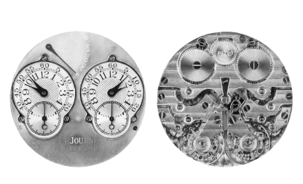

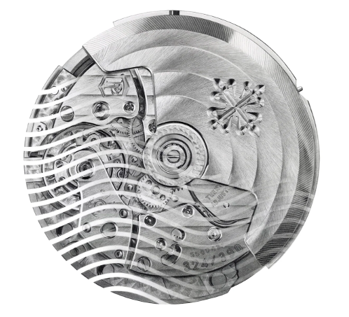
Each one of these pieces are so visually pleasing from the extensive detail in the watches to the composition of the piece itself. I really love how in Julie Kraulis's work she takes an object and makes it look so interesting in design, it makes it really compelling to look at and even analyze. My favorite of the three is probably the first, "A. Lange & Söhne Datograph", because the detail on it is amazing to make it look really realistic but the composition of it mainly is very eye-catching which made me want to learn more about her work and about the deeper meaning behind her piece. As I am an artist also interested in graphite I hope to be able to use my compositions and detail in a similar way to hers that makes the viewer interested as well as represents the full potential of a monochrome medium.
Links:


Comments